09
Maryland Institute College of Art
Brand Identity & Package Design
2019
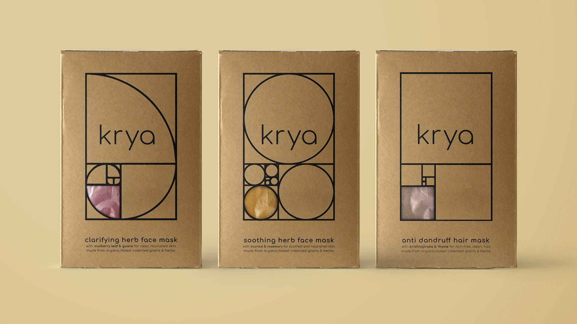
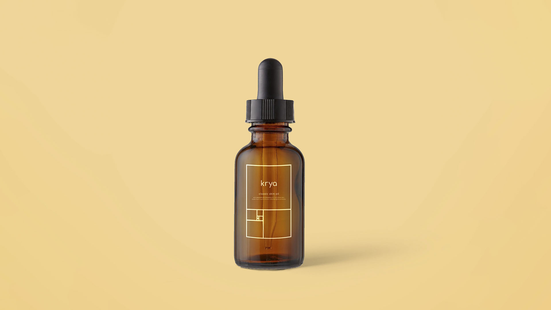
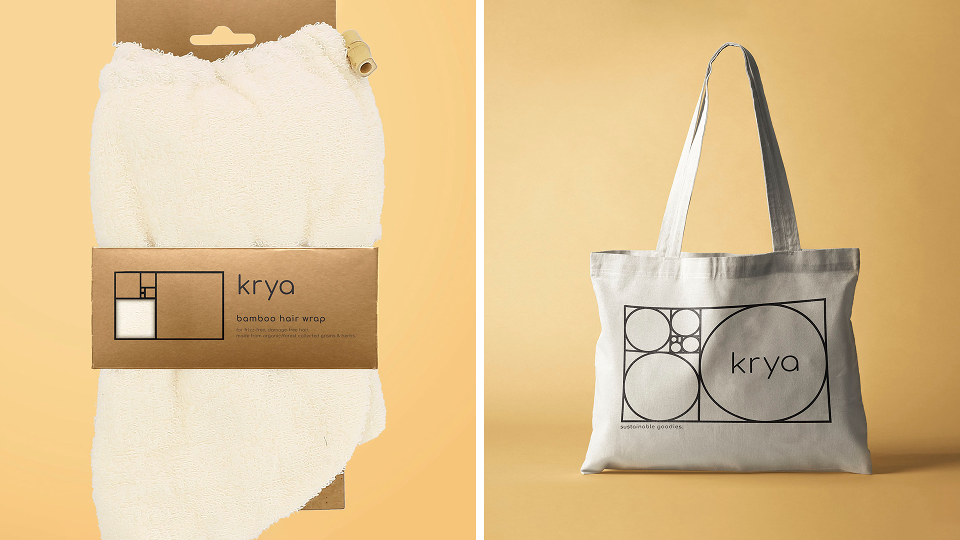
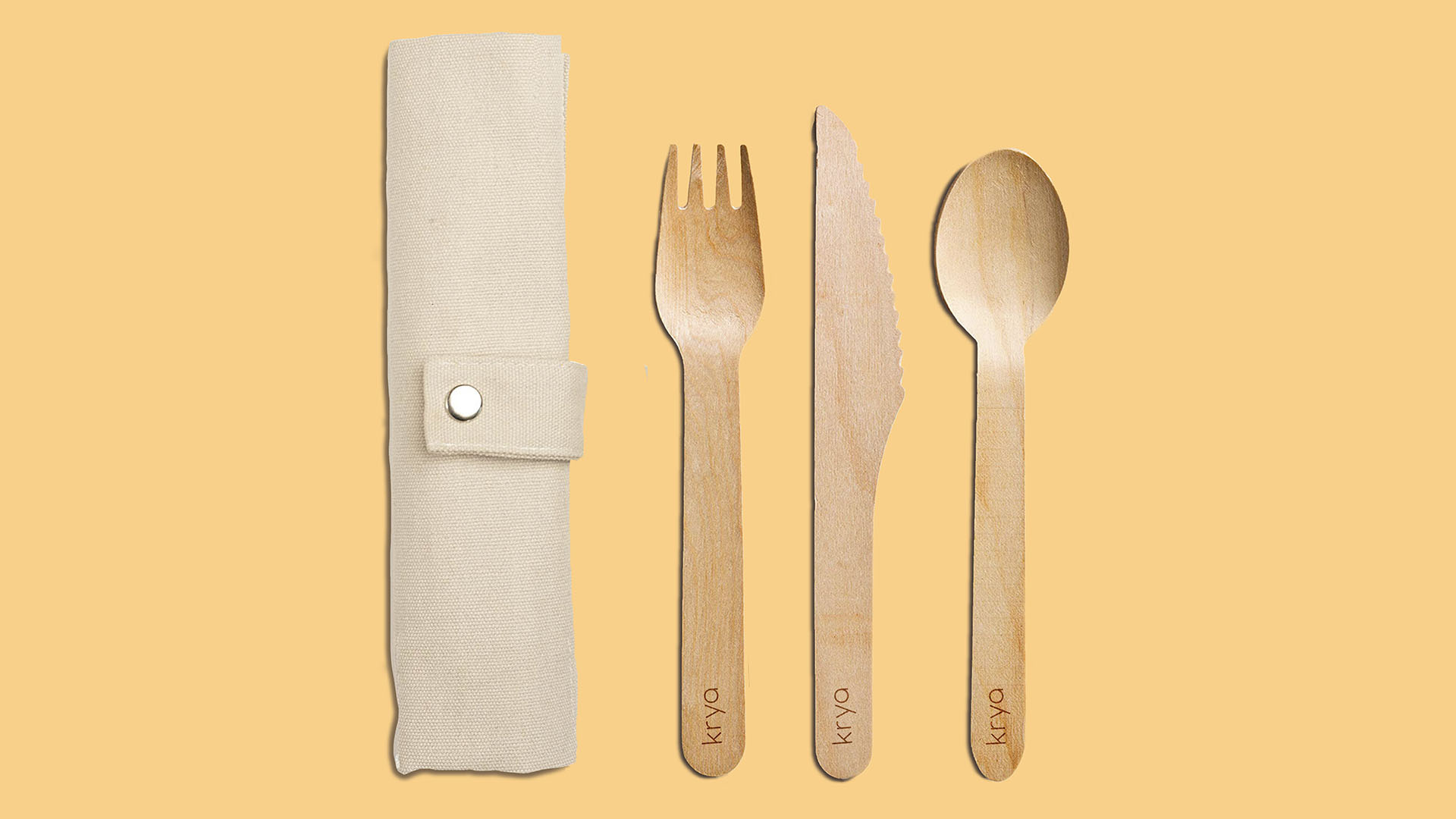
Krya Rebrand
The company Krya advocates for a well rounded, holistic, and balanced lifestyle, through the use of their natural products and through natural practices. These ideas of balance and nature were considered when creating this fictional rebranding. The golden ratio is a natural balance that manifests itself in the world, it seemed the best fit for a visual representation of the Krya brand. The different ways the golden ratio can be represented acted as the baseline for the logo system. The cut-out element of the system became a way for the user to interact with and understand the product.